Blog Archive

Wednesday 30 January 2013

Composer Profile

Our composer is James Richardson, a seasoned veteran on the music front. We are truly blessed to have such a talented individual such as James to compose for us. Not only is he brilliant at composing, but his piano playing skills are unparalleled even by the likes of Lang Lang and Billy Joel.
James's composition technique favours the classical genre, as this was a genre that he enjoyed for many years, and indeed still has a passion for. Some of his favoured classical composers include Rachmininoff and Beethoven, who are his inspiration. He generally composes for the piano, this is how he started out, but he does have plenty of experience composing for other classical instruments, including the cello, which is an instrument that features in his score for the opening sequence.
James has composed for a film for us before, where his track ran the length of the film . In fact, he also played the lead role in that film, and played the piece at one point in it! James also has a small cameo in our opening two minutes, where he plays Jim Stretzel, the man who everyone is trying to get to.
James has worked with us on multiple occasions and we have a great working relationship with him, so  he knows exactly what we want, and he'll get it right every time.

Soundtrack Update

Our composer has given us a rough score for our film, and it is sounding very strong so far. It has been recorded directly off the keyboard using synthesised sounds, so it doesn't sound particularly realistic at the moment. However this is only a temporary measure, as in the end we will record it properly with live instruments so it doesn't sound as fake.
The score itself is exactly what we were looking for. It is fast paced and builds to relevant climaxes very well. It begins with a simple single note being played again and again in a simple equal rhythm just hitting the beat. It then starts to build up the layers, with different intruments taking simple yet effective tunes and rhythms. Some of the instruments take faster notes, and this allows the piece to build up dramatically. When Yung gets shot the music pauses for a few seconds to allow the drama of it to sink in and the audience to have a temporary break from the intensity. There is also a break when Yung smashes the earpiece, which is both to highlight a change in pace, and also so that the music can come back with even more intensity when it returns and Davidson has started running.
After Yung is shot, the music becomes more melancholy, but still fast paced. There is a bit of a piano solo and I think that this really adds a new dynamic to the piece as it shows Davidson's emotions at the death of his friend as well as the intensity of the fight sequence. The music ends perfectly at the end and it perfectly tailored to fit the piece.
We still have to record it properly using the cello, bassoon and piano, so I'll have to record this with the composer because I play the cello and bassoon. We are, at the moment, trying to find a good time to record all the music and we should be finished by the end of next week! The music is the real issue now, and once that is done we will just about be finished.
Here is what we have so far:


Tuesday 29 January 2013

Shot Evaluations - The Final Shot

The final shot is very important in any opening, as it is, essentially, the last thing that the audience sees before the film moves into the opening credits or next scene. They will remember the opening by the final shot and possibly their opinion of the film could change because of it!


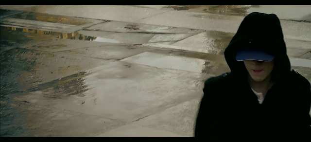
The interesting thing about our final shot is that it is in black and white. The shot doesn't start in black and white, but is very desaturated, and then it slowly changes as the shot goes on, to create a seamless transition. The subtlety is almost unnoticeable, except if you put the first and the last frames next to each other, and then it becomes clear. Interestingly, the opening shot of our film starts in black and white as well, so it comes round in a circle, starting in black and white and ending in black and white creating a cyclical feel. The opening shot goes from black and white to full colour, whereas the ending shot goes from colour to black and white. It is very hard to notice the black and white in the opening shot, as the train tunnel is just about only black and white anyway, but by adding the effect it just defies any possible colour creeping in. The significance of this is that he is leaving the scene after a disaster. The mission has just gone wrong, and his life must turn in a different direction, and clearly the direction wont be a good direction. He is walking into the grey horizon. In the openign shot the significance was that this mission was a great opportunity to get out of the bad life and into the good life, and this is neatly reversed at the end, when he has to go into an even darker life, as if all attempts to reach the light only end in a deeper darkness. Davidson is also walking into this darkness, showing that this is the next road of his life that he must journey down. A few posts ago I analysed a shot I named 'The Establishing Shot', where I said that there is darkness where Davidson is coming from, yet light where he escapes. In this shot it reveals that there is no light on the other side, only a deeper darkness, and the mission has failed badly as the supposed light has 'gone out'.
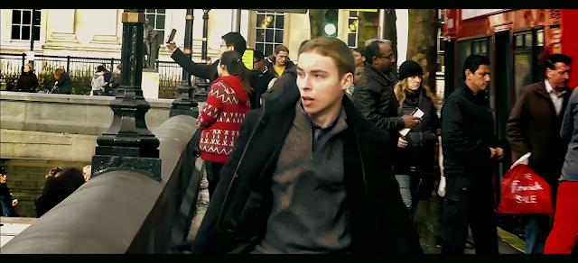
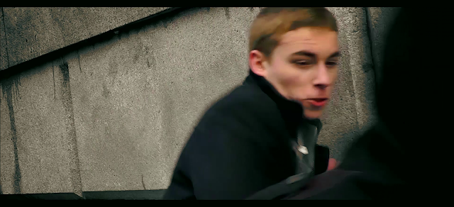
At the start of this shot Davidson is out of focus and quite blurry so not a lot is seen, then it becomes clear that it is Agent Davidson walking away. This makes it seem like Davidson is trying to get his head straight, and he can't figure out what has just happened. The slight colour in that shot is like the last ember of hope, yet when he comes in focus it is like he has figured it out and he has descended further into the darkness. With the loss of colour and sharpening in focus, Davidson loses all hope in reaching the light, and realises that the only path remaining leads to darkness. The dark coat that Davidson wears compliments this scene, as with the black and white effect, he effectively becomes a silhouette. It is as if he is shrouded in shadow and is an agent of darkness itself. Even his trousers become black, and he becomes a dark figure.
This shot overall is very effective in evoking the emotions of the characters in the scene. It clearly shows Davidson's descent into darkness without a single word being spoken, and the audience realises what is going on. It follows 'The Death Shot' neatly, as with that you can see the shadows creeping in from the side of the shot, whereas here the whole shot is covered in darkness, so the descent is made more obvious through this.

Shot Evaluations - The Statue Shot

This shot we came up with on the day as we thought it could add a very interesting dynamic to the scene. It is essentially just a cutaway, but I think that it is a very important cutaway


This seems a very strange shot to include in our opening two minutes as it is completely contrasting to the shots directly before and after. The reason we included this shot was because we thought that the statue looked like it was shocked about something, reflecting the emotions felt by the audience at the time. It almost seems like even the statues are shocked at what they have just witnessed. I particularly like the water droplets down their arm and on their back, as it gives them a more weathered, beaten look, which works in making the scene as a whole look more rugged. I also like the white spot on their head which looks as if they have been struck by a bullet as well. The statue has caught a fish, and I think that this symbolism works well, showing Davidson caught in a trap and he'll have difficulty getting out.
In the shot we can see that the statue is in focus, and the background slightly out of focus. For example, compare the quality of the statue to the quality of the woman in the background on the balcony. It is clear to see that the statue is the main centre of attention. It covers the left and middle thirds and the bottom of the right third, which are the most powerful places in the shot, so again, we leave the audience with no doubt that the statue is the most important feature of the shot. This is very important, as this shot, as I said, seems a bit out of place and random, so we made sure they knew they were supposed to be looking at the statue so that they could search for symbolism instead of wondering if it was supposed to be there or not.
There is not that much to talk about with this shot, but I decided to analyse it so that there was no doubt whatsoever about it's significance in the film. I feel that it is a very important shot, and it definitely adds a new dimension to the scene. As well as reflecting the emotions it also gives the audience a momentary break away from the constant action that had governed the scene up till then. It also leaves the audience in suspense for a brief second. They have just seen one of the major characters in the scene get shot, and then they are taken away from the action wondering what is going to happen next. It allows them to take in what they have just witnessed and wonder what they are about to witness. Overall a very important shot for the pacing and emotion of the film!

Shot Evaluations - The Fountain Death Shot

This shot occurs as Yung is being shot at the fountain, just after having walked up to it and exchanged eye contact with Jim. The interesting thing about this shot is how we got the shot as it is in a rather interesting position:


This shot was taken from on Nelson's Column. We obviously couldn't climb all the way up the column as it is very high, but we got a few layers up it (it's legal!) and I took it from there. I had to zoom in a lot, which normally doesn't work very well, but in this case it worked and the picture still came out at a very high quality. The other issue with zooming in is that it makes the camera very unsteady, but I luckily managed to hold it still enough. If the shot hadn't work then it would have been a bit of a disaster as we couldn't convince Richard to fall in the fountain more than three times and the first two were fairly average.
By having a shot from this high angle the shot looks very high budget and gives it a very high production value. If people were to know the geography of Trafalgar Square then they would wonder how we got that shot as it doesn't look like it was taken from the column. It just appears to be hanging in mid air as if we used a jib or a similar mechanism which are only really used in very high budget films. This illusion is also helped by the fact that there is a woman with an iPad on the close side of the fountain, and the camera is clearly at a higher level then her, showing that it isn't just elevated in a normal way.
This shot then cuts to a mid-shot from behind Yung of him falling in, which helps focus the attention, as in this shot he doesn't seem to be the centre of attention. We did this so that when he is shot, it is more surprising and the audience are more shocked as they wouldn't expect it from the angle that is given. The music helps sell this effect, as it is obviously building towards a climax, but they don't know what that climax will be. From this shot the audience would assume that something was about to happen on the left third of the frame, as that is the empty side which they would presume should be filled up. By having Yung dying on the right side of the frame it seems almost wrong, which brings the element of surprise in further.

Shot Evaluations - The Death Shot

This shot occurs directly after Agent Davidson has killed his opposition and just walked off screen. The camera lingers on this shot for a few seconds and this is very significant, so I would like to explain all the connotations:

The most interesting feature of this shot is that the man dies in the shape of a gun, you can see his legs as the gun barrel, arms as the trigger and the head as the grip. The gun has many connotations, it is associated with power and authority, whoever holds the gun has the power. In this case the connotations are subverted so the dead person holds the power. This foreshadows what will happen later in the film, that he will regret what happened at Trafalgar Square and killing the agent. Davidson will be haunted by the ghosts of the past forever. Alternatively this gun could represented as Agent Davidson having the power and leaving destruction in his wake. Even when he kills they fall in the shape of weapons. The red colour of the shoes is to represent blood and anger, which are both significant themes in the film.
On the left of the screen we can see the wall is damp, but not just a normal sort of damp, the dampness is incredibly dark and foreboding. It has the feel of dripping blood and definitely looks very sinister.It could also represent the world going downhill and rotting away with filth. There is also a dark shadow that seems to be approaching from the right side of the screen which is representative of shadows closing in on Davidson's life. In fact the only real light in the scene is over the dead body which was Davidson's last success creating an interesting paradox.
These colours wouldn't be nearly as prevalent without the colour grading, which we spent a few hours working out. Colour grading is very important, not just to give it a more polished, rounded look, but also to create a lot of symbolism and subconsciously evoke certain emotions.

Shot Evaluations - The Establishing Shot

The next shot that I will analyse is the establishing shot, where we establish the location and another character. It is not a conventional establishing shot as it isn't very wide, but it still 'establishes'.


In this shot we can see that Yung is in Trafalgar Square, the other side to Agent Davidson.We have made sure that we didn't cross the line, even though they are not talking face to face, in order to orientate our audience easier. This is the first shot of Yung, which is used to establish where he is in the square and who Yung is. Most of the shot is a sort of dull grey, but Yung clearly stands out through his bright yellow backpack. The backpack was a last minute addition on the day, as we wanted Yung to appear young and inexperienced. The bright yellow backpack makes him an obvious target and also defies the conventions of agents looking cool and suave. It is also clear that Yung is the main feature of this shot as he is in the centre. Nelson's column is just to his left, and this is framed in a way so that an audience reading the screen left to right would see that he is in Trafalgar Square first, and then see who Yung is, second. The fountain to his right provides colour and brightens up the scene a bit more, adding contrast to the dull stonework. Overall the shot is split into three neat thirds, the first establishing Nelson's Column, the second establishing Yung and the third half providing a sharp colour contrast.
The shot also gets progressively lighter from left to right. This was planned so that it seemed like Agent Davidson was in danger, and his escape route at the end was on the right of this shot. It subconsciously forces the audience to associate the side of the square where Davidson comes on with danger and the side he comes off with escape and freedom. Even the sky gets lighter, and there are dark clouds covering the darker side of the square. Obviously we couldn't plan this on the day, so we colour graded it afterwards. I particularly like the dark, obinous colours of the buildings on the far left, as this provides a very sinister backdrop to the film. Although these aren't obvious tricks, the audience is subconsciously affected by it, and it really adds to the dynamic of the film.

Shot Evaluations - The Hero Shot

For the next few posts I will be analysing a few of the shots that we created in our film and why we framed them in such a way, in order to give you a deeper inlook into how our film was made. Every shot was meticulously thought out and we took our time on each one in order to present the highest quality film we could. Unfortunately it would be just about impossible to analyse every shot in the film, but by just analysing a few I hope that I can assist you in gaining a much deeper insight into the level of detail put into our film. Here is that shot which we have aptly named 'The Hero Shot':


This is a bit of a strange shot as it is unconventional to leave such a big empty space on one side of the screen. The audience feel like something is missing and this is exactly what we were going for. This shot occurs directly before one of the antagonists comes round the corner and they engage in a fist fight. Agent Davidson is waiting for him to come around the corner before striking him down. By leaving the empty space, the audience, like the character, are anticipating the antagonist coming roun the corner, and they can see that there is going to be a fight. The empty space shows the audience the 'battlefield' so they are ready for a climactic fight. This space also creates tension as they are not sure what is going to happen, it makes them feel a bit uneasy as it is so unconventional. Agent Davidson controls the most powerful third of the screen as the audience reads from left to right, so this makes the audience sympathise with him. However, he only covers one of the thirds, and has no control over the other thirds, which reduces his power in the scene, creating a visual oxymoron.
The camera is positioned slightly lower then Agent Davidson - a slight low angle shot. This is sometimes called the hero shot, as it shows them as powerful and great people. From this the audience realises that he is a powerful person, but as the camera is only at a slight low angle there is still a chance that he wont succeed. It is clear that the antagonist will approach from lower then Davidson as it is established that the fight will take place on the steps, so we can see that they are slightly lower in status to Davidson.
Davidson's pose makes him seem ready to fight, but also slightly worried. You can see the anxiety on his face, which is from the sudden turn around of the days events, and he is also worried about how powerful his immediate enemy is. His shoulders are locked in position, showing his uncertainty, and both arms are positioned for the attack. His hands are half closed in a fist, yet not completely, showing that he is not completely ready for the fight as he was not anticipating having to fight someone that day. He his a bit uncertain about the fight which compliments all his other body language.

Production Stills

 Here are a few stills from the film to give you a feel of what the film is like. We think that these snapshots encapsulate the mood and the emotions of the film:


The establishing shot of Trafalgar Square and the character 'Yung'. An interesting contrast of colours between the backpack and the rest of the picture helps the audience's eye to focus on the character.


The start of Agent Davidson's run into Trafalgar Square, the concerned look on Davidson's face juxtaposes dramatically with the casual disposition of the tourists in the background.


This jump was hardly necessary to the advancement of the plot, but it kept the run fast paced and added a brief element of danger, no matter how small, as well as highlighting the athleticism of his character.


In this shot it is established that Jim is aware of the danger he is in. His expression gives the impression of a deer in the headlights. The fountain in the foreground helps to show the audience that it is from Yung's perspective, as well as helping to orientate the audience.


Here you can see a mysterious character advancing on Caprivi. An element of threat is introduced on his side of the action, however it is an unresolved enigma by the end of the opening two minutes, making the audience want to find out more and continue watching.


A close-up of Yung that helps establish his method of communication. The empty space on the left of the shot assists the audience in showing where the recipient of the call is.


This low angle shot shows Agent Davidson as the protagonist of the film.


A very high budget-looking angle of Yung getting shot. It looks as it this has been shot on a crane, but in fact was filmed by climbing on one of the layers of Nelson's column. 


Another shot of Yung's death.


Another shot of Yung's death.


Another shot of Yung's death.


This shot is particularly interesting, as it shows Davidson's reaction to the events from a high angle shot. This mirrors a previous shot of Davidson from a low angle - when he had some power there was a low angle and now, after his loss of power, he is shown using a high angle to highlight his insignificance.


In this shot the Jim is shown escaping, and out of the crowds two daunting figures appear, disguised with caps. The plot thickens.


The escape of Jim. This show highlights the failure of the mission. The red buses in the background are an iconic feature of London transport, representing Jim's escape through iconic features.


Agent Davidson is regaining power through the low angle shot and his position in the most powerful third of the screen.


This is a direct opposite to the previous shot. This character is clearly less powerful - shown through the high angle shot and his position in the least powerful third of the screen.


The first shot of the fight. The antagonist appears a sort of black shadow, which appears very daunting.


Over the shoulder shot showing a close up of Davidson's face and the concentration going into every blow.


This shot almost seems from the perspective of the antagonist, as Davidson's head is completely cut off. This makes it seem as if Davidson is not only one step ahead of his opponent, but one step ahead of the audience also.


An example of the dutch tilt that makes the fight seem even faster paced and more wild, with shots that aren't evenly lined up.


                                                                                                                                                                            Another slightly tilted angle, but less so this time, to reflect the fact that Davidson is now starting to 
control the fight.


The dead body from a high angle. Significantly dead in the shape of a gun.


An out of focus shot that makes Davidson seem like a shadow, as if he is disappearing which, in essence, he is.


Davidson walks off into the distance. The shot is in black and white, but isn't so noticeable as the original shot was very grey anyway. It indicates a new stage in the plotline.


Monday 28 January 2013

Soundtrack

For our soundtrack we have managed to persuade a good friend of ours to compose for us. This will make it look much better as we won't have to adjust the music to fit the picture, or spend hours surfing the Internet to find a suitable piece of royalty free music. Instead the music will be tailored perfectly to the images, with relevant breaks, dynamic and tempo changes.
Our composer is trained in Classical music composition, which should add and interesting element to our film, as it would seem much more high brow, as well as adding depth. The music will have an almost melancholic feel to it, as if the audience is looking into an unchangeable past. However at the same time the music will be intense and fast paced, building towards small climaxes and all the while working towards the big climax. The music will control the tension of the scene, and will reveal to the audience when something bad is about to happen. Alternatively we could use the music to completely surprise the audience, as if we were to have happy music for most of it and then suddenly someone gets shot then we would catch our audience off guard and they will be on the edge of their seat. This is not, however the feel we're going for. We want it to be serious and intense from the outset, so the audience know that something is going down, and they'll know ahead of time things that even the characters wouldn't know. The fact is, the music will control a lot of the factors in the scene.
That said, I don't want the music to be too overpowering. By composing music separately we run the risk of the music being more obvious then the action and the dialogue, and the audience concentrating on that more. The music needs to be able to support the action, but not become the main source of attraction. It would be really bad if it just became a music video, or if it was mistaken for a trailer. Another problem is that we need to be able to record the piece of music. My co-worker and I have decided against recording off an electric keyboard using synthesised sounds, as this wild sound very fake and every cheap. Instead we're going to make sure that the score is composed for instruments which we are able to play. These include:
-Piano
-Cello
-Violin
-Bassoon
-Drums
-Guitar (electric & acoustic)
-Vocals
This gives us a very wide range of instruments to compose with, however seeming as some of us play multiple instruments we'd have to layer them. We have enough recording equipment to record it to a professional standard, so the final piece should come out sounding pretty decent. I have full faith in our composer to compose an incredible score that would rival even the greatest professional film composers such as Hans Zimmer and John Williams and the overall project will be greatly improved by his contribution.

Friday 25 January 2013

Background Noise Replacement

Seeming as we have replaced all the dialogue in the sequence using ADR, we also have to replace all of the background noise and sound effects in the scene, which is quite annoying. Basically all the sound which you will hear in the final piece has been replaced apart from the occassional line. We now regret not filming some background ambience at Trafalgar Square while we were there, as that would have seriously helped with replacing it. We only thought of it afterwards, and now if I were to do it again I would definately go around the square and just record sound in the various places. To replace the sound, however, we came up with a list of sounds which you should be able to hear around the square:

- Fountains
- People talking
- People walking
- Children laughing
- Traffic

All these sounds had to be replaced in order for it to sound convincing. Admittedly we did add in the sound of children laughing, purely because we thought that it would add to the atmosphere and slightly put the audience on edge if they could here that children were in danger of getting in the way of the danger. We managed to find some royalty free sound effects of city bustle, which covered people talking, walking and the sound of traffic, which was handy as it meant we wouldn't have to go through the painful process of mixing everything together and trying to make it sound convincing. We added in the sounds of the fountains and of children playing, the fountains because they were there and the children playing I mentioned above. The annoying thing about the fountain sound effect is that every time that the camera goes back and forth between Yung and Davidson we have to fade the sound of the fountains in and out. Hopefully the music will cover this up a lot better, but I don't think it's too noticeable anyway.
We also had to add in a few sounds that weren't there originally to make it more realistic. Here is our list of sounds that were not there on the day but were added in as they needed to be for realism and for our storytelling:

- Punches and hits
- Gun hit

If the film didn't have any of these sound effects then it would seem absolutely terrible. Without them it is very obvious that the whole thing is fake, and that is what we most certinaly do not want to do! A lot of fights look bad purely because they don't have decent sound effects. We downloaded a royalty free package which included a variety of fighting sound effects, which we had used previously on the Preliminary Task. By mixing and matching these sound effects we were able to construct very realistic sound for the fight. The gun hit was difficult to work out. We didn't want there to be a loud gun sound effect, otherwise everyone in Trafalgar Square would have heard it and it would have looked wierd with no one running away. We also thought that it would probably be a silenced sniper rifle anyway, so instead we just included one of the hitting sound effects, so it doesn't look as if he just had a heart attack.
In the station we needed a very different group of sound effects. We didn't want a noisy station full of people as that would be distracting, so instead we just added the sounds of the train and the announcer and just a few people. The sound of the train coming into the station was recorded live with the clip and if one of the few sounds actually done live!
Overall I think that the sound mixing went very well and it sounds very good! It should sound even better when we have the fully recorded soundtrack to go behind it, and I am very excited about the final result!
Here is our rough edit without music and only the new sound replacement:


Thursday 24 January 2013

Title Tricks

Titles are a big part of our opening sequence as they are with most films, so we have thought very carefully about them. The interesting feature about our titles are the way they move onto screen and the way they disappear. Instead of doing the standard in and out titles with no sort of interesting transition, we have put them so that the characters and the action in the scene wipe the titles. Although this isn't necessarily something that people would pick up on very easily, it still adds to the overall slick feel of the piece and subconsciously adds something. Examples of these wipe are when 'Lauren Chambers' is wiped by Jim's head and when another title is wiped when Agent Davidson hits his opponent and their head goes through the title. There is another one where a double decker bus introduces a title, and yet another when Lee is running, and the title gets wiped by the people in the square.
We feel that this stylish transition is a very neat way to introduce our titles, and will add a new dimension to the titles. It also involves them in the scene and makes them melt in with the action more, so that they are not too intrusive, yet still noticeable. Another thing that I like about these transitions is that it seems to make the action jump out of the screen a lot more and come to life, as the titles and action interact with eachother to create a more rounded image.
If the audience do however, pay special attention to these titles, then they would think it looks very sophisticated and clever, so it's not all about the subconscious power of the titles. It gives it very high production value and makes the overall production look a whole lot more professional.

Wednesday 23 January 2013

Fonts

For our credits font we wanted to create a font that stood out and looked modern and exciting, yet at the same time shouldn't be too showy. We didn't want anything too complex and arty as it wouldn't give it such a high brow look, and it would reduce how neat and clean the film looks. The credits shouldn't be too intrusive, as they would distract the audience from the action, and they shouldn't be so simple that they distract the audience because they look so amateur. Overall I don't think that the font should be showing off in anyway, just simple, yet classy. After going through numerous font websites, the font we finally chose was this one: 'Revolution'


This was exactly what we were looking for. It is very classy and I like the neat edges, particularly the sharp 'V'. It stands out, but not too much, so it doesn't intrude on the action. Overall a very stylish font that works perfectly.

For the title we wanted something slightly different, as it had to stand out a lot more to show people that they have to look at it. We wanted something relatively simple and classy, but with a bit mroe extravagence as well. It couldn't be as simple as the credits, or it wouldn't stand out enough. We took inspiration from the 2012 film 'Skyfall', which is a similiar style film of the same genre.


As you can see, there are still the sharp, neat edges to it and it still looks very classy, but it has a distinct eroded sort of effect to it, which looks very good, as it captures the mood better. It's just a simple little adjustment, but it really makes the title stand out, and the audience would realise it is something special. We chose a fairly basic font, and we edited it quite a bit, so we got a similiar erosion effect, except our erosion looks slightly different. Instead of having the sort of faded erosion that the Skyfall logo has, ours has a more scratched type of erosion that makes it look as if it has been attacked, and it gives it a more violent look. I don't think it would have suited Skyfall as well, as the font in Skyfall reflects the film, but I really think that this different erode really suits our film. Here is our completed logo:


Friday 18 January 2013

Opening Titles Analysis - Sherlock Holmes

These credits are some of my favourite film credits of all time. They are incredibly creative and they work extremely well, holding the interest through the entire credits. Admittedly they are ending credits, but I think that they are suitable to  analyse for opening credits, as they complete the same purpose. What I really like about these credits are they way that they show bits of the action and then pause it, change the image to look like parchment, throw in a credit and then carry on. We used this technique in the credits for one of our edits of the preliminary task and it looked extremely cool and stylish.
However, as with Skyfall we cannot do this in our opening sequence, as we have live action and this is partly animated. In a way I wish that we could have more time to add an animated titles sequence in afterwards, as I thik we could do this in a very exciting and interesting way inspired by these examples I have been analysing. The font in this isn't really what we are going for either, as the old style, handwritten font is good for period films, but not necessarily for modern action films set in the present.
Overall there isn't a lot that I can take away from analysing this titles sequence, as I can't do the font or the animation, but I thought I'd share it as this is a good example of a very strong titles sequence, but not one that we are going for. It isn't the right style and we can't afford to use up some of the time on the animation, which is a shame, but if I were to make the full movie then I would definitely take some inspiration from this titles sequence.

Thursday 17 January 2013

Opening Titles Analysis - Skyfall

I have decided to analyse some opening credits sequences in anticipation for ours, seeming as we have to add titles to our opening. I'll be going through what I like and dislike about the titles and what I can take inspiration from.


All James Bond films are notorious for their extravagant opening credits sequences, however the latest - 'Skyfall' is set to top them all. In these opening credits you can see that the whole thing is animated with seamless transitions between the different sequences, all flowing together to make a very interesting animation. Of course, we wont be using animation in our opening two minutes, but I can take inspiration from this for a later project.
The part of this sequence that I do want to analyse is the text that appears over the top of the video. The text has the effect of being tilted away from the audience, giving the impression that it's in 3D, even though it's not. This is a very neat effect, but I don't think that it is suitable for our film, seeming as it will be going over live action and wont look nearly as good. Over live action I think that it would look very cheap and would lose the high brow look that it has on James Bond. It would make it seem as if we had tried to make it look impressive with a high production value, but gone over the top, and ended up tipping the other way. Instead what I like about the font is that it is a very neat, classic style font without too much to it. If it is going over live action then I think that a more normal font would be suitable so that the audience isn't distracted by a cheap visual effect. It would give it much more of a high-brow look, which generally gains a wider audience, and is what I prefer to look at as well. I would be very put off by a font that was bright red and dripping blood as that is the sort of thing that amateurs put in films to try and make it look better, but it ends up looking worse.
Overall from these opening titles I can see that in mine I would likea very clean, suave font without too much effect added to it. I think it is alright to have the title of the film looking different and exciting, but I don't think that the font for the credits should be in this style otherwise it would look very over-the-top and the action would be forgotten.

Wednesday 16 January 2013

ADR Research


We decided to scan the internet to see some other media tasks where they have replaced the dialogue after the shoot, and we found one which we could particularly learn from. In the above clip it is obvious that the dialogue has been replaced in post through ADR, and there are a few things that make this obvious and detract from the realism. I will examine these to learn what I can!
The first, most obvious mistake is the fact that the dialogue is unnatural. Whenever there is talking unaccompanied by music the clarity of the voice and the microphone quality seems out of place and almost 'too good'. It doesn't have any sense that it was spoken outdoors at all, and sounds very much like it was recorded in some sort of studio. The actor's facial expression and passion does not match the weight and volume of the dialogue. It is almost as if the actors are only going half into the dialogue for the sake of not making too much noise. At points where the actors are meant to be shouting, instead they are just talking normally, and this looks very strange and unrealistic. We can learn from this by making sure that all the dialogue that we record is recorded in roughly the same circumstances as the ones where the dialogue was filmed. In our case this meant going outdoors, where the sound doesn't bounce off the walls so easily. It also means recording the dialogue with the same camera in order to get a sound that matches the picture.
The next mistake that I picked up was the foley in the background. There were too much bird sound effects in the background, which sounded very over the top and almost cliche. In the case of sound mixing cliche isn't always a good thing, as it detracts from the realism, and it just sounds plain bad. The birds in this case are almost like they are there solely to fill the space, when there wasn't much other sound in the scene, like a cover up. Also, on the note of foley, there are very inconsistent footsteps. Sometimes when the mother is walking there are sound effects of her footsteps, but sometimes there aren't. As much as this is only noticeable when you examine it closely, sub-consciously the audience realises that something is slightly off, and it, again, detracts from the realism. It also makes the audience start to wonder what is wrong, and while they are being distracted by this they lose concentration on the action on-screen. From this we can learn to make sure that we add in all the background sound effects that are supposed to be there and not add in any background noise that isn't there. If we disobey either of these rules then it would end up sounding odd, and all the effort put into the composition of the picture would be lost entirely. We are not trying to be creative, we are trying to repair something.
We should be able to download a royalty free sound effect of London from somewhere on the internet, so we'll use it to put in the background, and the perhaps mix in sound sounds of the Trafalgar Square fountains.

Learning ADR

To help us in the ADR process, we watched several tutorials on Youtube and found this one particularly useful:

ADR

ADR stands for Additional Dialogue Replacement. It is the process of replacing the dialogue in the scene when it isn't clear or there is a lot of unwanted background noise. This is a big problem with our first edit, and a lot of the time you can't even hear what the characters are saying, so we will have to go through the process of ADR.
The first step is to give the footage to the actors and ask them to listen to the lines a lot, so that they know exactly how to say each line, how fast, and where to put the accents. If they speak at a different speed or put emphasis on different words, then it would not work very well and it would be obvious that the dialogue has not been recorded live, breaking the illusion. We gave our draft edit to the actors, and they looked through it a few times.
The next step was to pick how we were going to record the lines. We considered using a RODE microphone in order to pick up crystal clear sound, but after doing a few tests we decided that it sounded out of place. Instead we are recording the dialogue using the camera's internal microphone that we used to record the sound live. It is pretty decent quality so it wont make much difference, but the lines will sound like they're actually in the scene, rather then obviously ADR.
We then chose the location to record the sound. The first place we tried was inside my house in the kitchen as it is quite an open space, but isn't too noisy. Unfortunately in these recordings you could hear the hum of kitchen appliances so it didn't sound so good. The next location we tried was just outside my house in the street, so that we got the sounds of the outdoors and it was a more open space. This sounded a lot more natural, and it fitted the scene much better.
Now it is a case of adding in the dialogue that we filmed, and adding in the foley sound behind it, in order to make it sound properly in the scene.

Tuesday 8 January 2013

Sins of the Martyr - Draft Opening

To celebrate the new year, we have a draft edit, of sorts, of our opening sequence for "Sins Of The Martyr", compiled of the footage that we shot last Thursday in London. As is stands, the current cut of the opening is a lengthy 3 mins 52 seconds, almost twice the length of the alloted time. However in the final edit of this sequence, editing will be tightened and the music (that I have taken from Hans Zimmer's score to "The Dark Knight Rises") will be replaced by an original score by my friend, James Richardson. There will also be significant ADR (Additional-Dialogue-Replacement) in order to make the lines more audible and there will be effects added to them to emulate telephone voices for the earpieces that feature prominently in the sequence.

For now, though, see this rough edit below:

Monday 7 January 2013

Post-Production

Post-production is the part of the filmmaking process that is the least exciting. It involves sifting through thousands of clips for a few seconds, realising you've forgotten to shoot a shot and painstakingly editing the soundtrack so that it matches up to the film.
Although the film is already shot, there is obviously still quite a lot to do. The first, most obvious thing to do it to check through all the clips and upload to the computer. We had the choice of two editing softwares - final cut studio and adobe premiere, which are both industry standard. In the end we chose to use adobe premiere as windows computers deal with the higher quality footage better then macs. I am not very used to adobe premiere as I prefer final cut, but my colleague is very good at it, so he will be holding the mouse during the editing process.
The clips all looked fairly good. There were a lot of things that could have been done better, such as there were raindrops on the lens in some of the shots, however these shots weren't the most important, fortunately. We also missed out a few shots, such as a shot of the top of the National Gallery, which we would have superimposed a sniper onto, to make it more obvious that there was a sniper in the square. This isn't too much of a problem, however, as the story still runs fairly well without that shot. Other then that it seemed that we had all the shots we needed and a lot more! On the day we had shot about 1hr10mins of footage for just two minutes! This was obviously a good move, as it meant we had a huge choice of clips, and it meant that we missed nothing. Our editing choices seemed endless!
The trouble with this, however,was that the first edit we came up with was 3mins 52 secs long, which is much too long. To counter this we cut out the lines about the case that Jim was carrying, and this cut out a lot of time. We also cut out a lot of shots from the underground, which greatly reduced it, as before it took over a minute for Davidson to get into the square.
We created another draft which should be coming soon, but there is still a great deal to do.