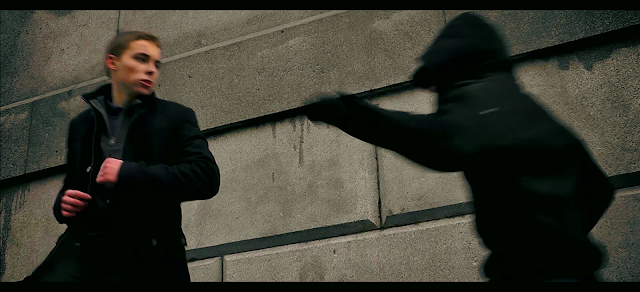
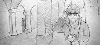
This shot we got very close to, although the final version was much closer to the tunnel then we thought was possible, so this was a very good change. It ended up just as we had visualised it.

In this we decided to switch around the camera angle when they came off the train, this was in order for the following shot to look successful, as there were only little window grates on one side of the roof.
Here you can see that the grate was much bigger than we had previously thought, and you could see the full body through the grate. This turned out to be beneficial, as the audience could actually tell who was walking past the grate.
This shot is pretty much exactly how we planned it. Even the position of Davidson's legs is exactly the same as the animatic.

Another very similar shot that worked out exactly how we planned. These two shots are a testament to the intense planning that went into producing the final piece.
Here Davidson is slightly further away than we had hoped so he looks slightly insignificant, but it still looks pretty similar.
Although this shot is slightly further back than we had previously anticipated, I believe that it looks far better, as you can see more of the location in the background, which helps to orientate the audience.
We used a different suitcase in the final product as we felt that it looked more stylish to have a suitcase with a strap that goes over your shoulder. If the audience were to look carefully they would see Yung in the background as in the storyboard.
Zubasu was positioned much closer in the final product as we found that he was too far away for the audience to notice in his previous position. We also decided not to have the sunglasses and the burger in the end for practical reasons.
Instead of casting the earpiece into the coffee we opted for the crush-under-the-foot tactic, as it looked infinitely more dramatic and built up the pace further.

Unfortunately we couldn't film this shot behind the pillars as we intended, as it made Yung look too small and insignificant.
In the end we did not position this shot so that Richard was in the background as he looked too small and it was too hard to choreograph. However it would have looked very good.
We decided that it would look better if Zubasu slowly advanced from the background of the shot as it matched the previous shot and built up the tension further.
This shot is almost exactly how we pictured it, although it would have looked good if he's fallen between the two spurts of water, however this was not possible.

The change from fighting in the lift to fighting on the stairs occurred as there was a cleaner by the lift who told us not to film there. Instead we had to quickly choreograph the fight on the steps nearby, whilst getting some strange looks from passers-by.
Dying in the position of a gun
was improvised on the day, and we thought that it was a very dramatic death
position.


No comments:
Post a Comment