
This was exactly what we were looking for. It is very classy and I like the neat edges, particularly the sharp 'V'. It stands out, but not too much, so it doesn't intrude on the action. Overall a very stylish font that works perfectly.
For the title we wanted something slightly different, as it had to stand out a lot more to show people that they have to look at it. We wanted something relatively simple and classy, but with a bit mroe extravagence as well. It couldn't be as simple as the credits, or it wouldn't stand out enough. We took inspiration from the 2012 film 'Skyfall', which is a similiar style film of the same genre.
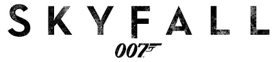
As you can see, there are still the sharp, neat edges to it and it still looks very classy, but it has a distinct eroded sort of effect to it, which looks very good, as it captures the mood better. It's just a simple little adjustment, but it really makes the title stand out, and the audience would realise it is something special. We chose a fairly basic font, and we edited it quite a bit, so we got a similiar erosion effect, except our erosion looks slightly different. Instead of having the sort of faded erosion that the Skyfall logo has, ours has a more scratched type of erosion that makes it look as if it has been attacked, and it gives it a more violent look. I don't think it would have suited Skyfall as well, as the font in Skyfall reflects the film, but I really think that this different erode really suits our film. Here is our completed logo:

No comments:
Post a Comment